
Brand Guidelines
This is a guide to the language and design elements that make up the Klausing Group identity. It includes advice, templates, and sample executions that demonstrate how to bring our brand to life.
Logos
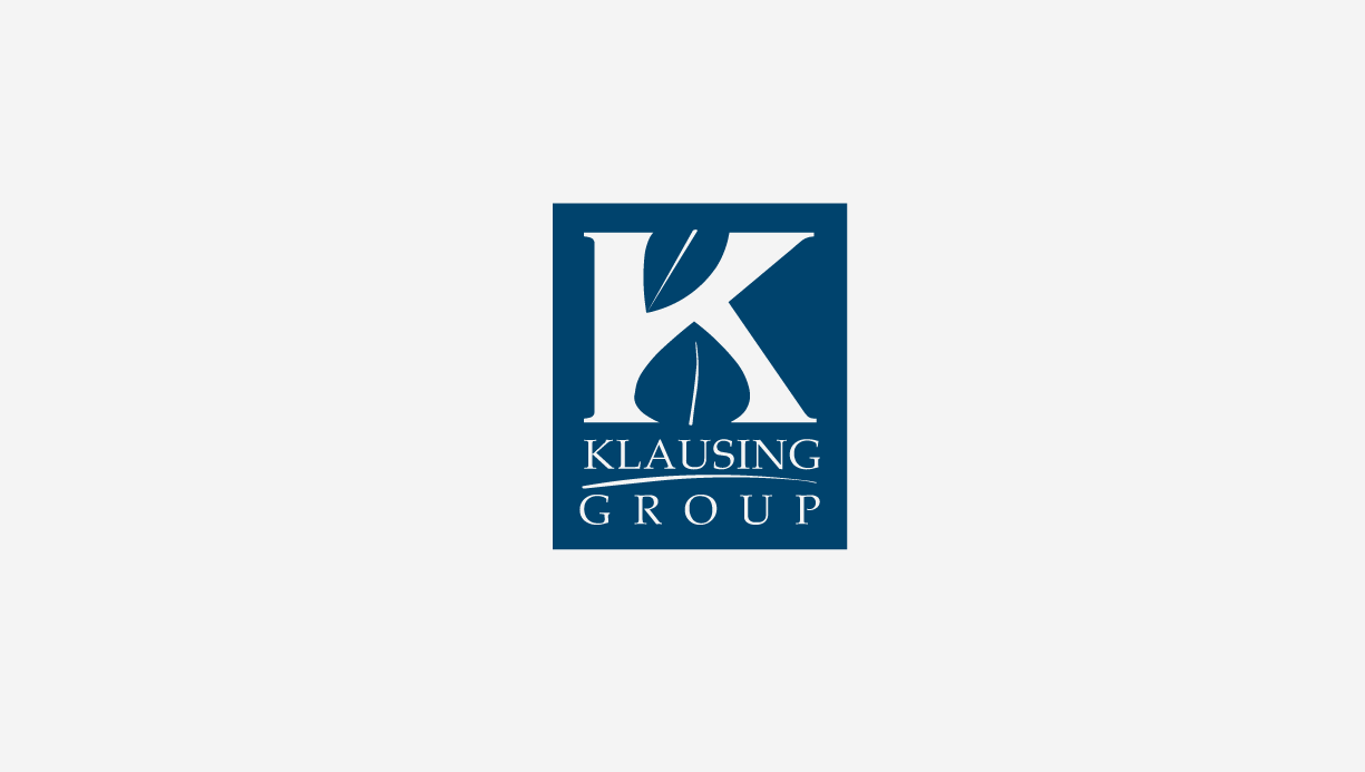
Primary Logo
This logo is the guiding post for the Klausing Group brand. It is our primary logo for all communications.
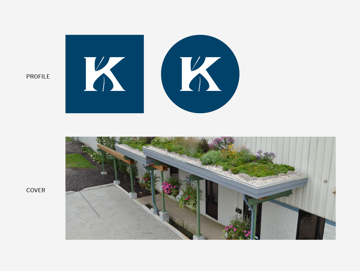
Symbol
Use the Klausing Group symbol primarily in applications that require high visibility at smaller sizes.

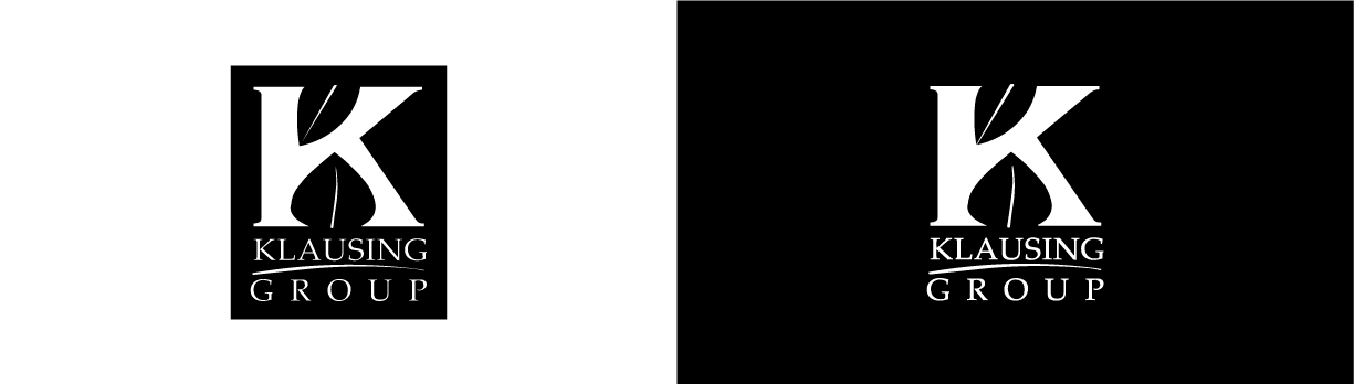
One Color Logo
Never invert the boxed logo. For applications on darker backgrounds, preserve the correct negative space by using the white version of the logo.
Clear Space
Always keep a standard amount of clear space around the logo, measured by the approximate size of the logo’s bottom leaf.
Minimum Size
The logo should never be applied at a smaller size than shown.
Improper Uses
1. Do not stretch or skew the logo.
2. Do not reorder elements of
the logo.
3. Do not color parts of the logo.
4. Do not rotate the logo.
5. Do not add elements to the logo.
6. Do not outline the logo.
7. Do not add drop shadows to
the logo.
Colors
Our Colors

Blue
Pantone 7694 C
CMYK 100 / 56 / 0 / 47
RGB 1 / 66 / 106
HEX #01426A

Green
Pantone 354 C
CMYK 85 / 0 / 98 / 0
RGB 0 / 177 / 64
HEX #00B140

Orange
CMYK 0 / 36 / 100 / 0
RGB 255 / 164 / 0
HEX #FFA400
Color Definitions
Color works differently in print than on screen, so you’ll need different color codes for each.
Pantone (PMS)
The Pantone system is used for precise color matching – you can give a Pantone reference to any printer, anywhere, and they’ll print the exact same color.
CMYK (Cyan/Magenta/Yellow/Black)
The print files will be delivered in CMYK color mode, which is suitable for commercial full color and everyday printing.
Note: If you try placing a CMYK file into a Microsoft Office program and the image doesn’t display correctly, try the RGB version.
RGB (Red/Green/Blue)
These colors are used in monitors, television screens, digital cameras and scanners. Digital logo files are in RGB color mode.
HEX (Hexadecimal)
This six digit code is associated with websites, viewed on a screen, and refers back to the RGB color.
Typography
Examples
Fonts express as much as words. They convey feeling, establishing a consistent and ownable visual language for Klausing Group.
Use the Lato font family for all of your typographic needs.
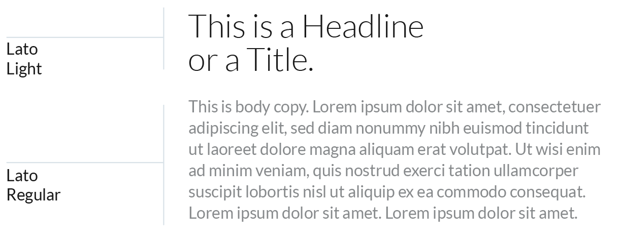
Headlines
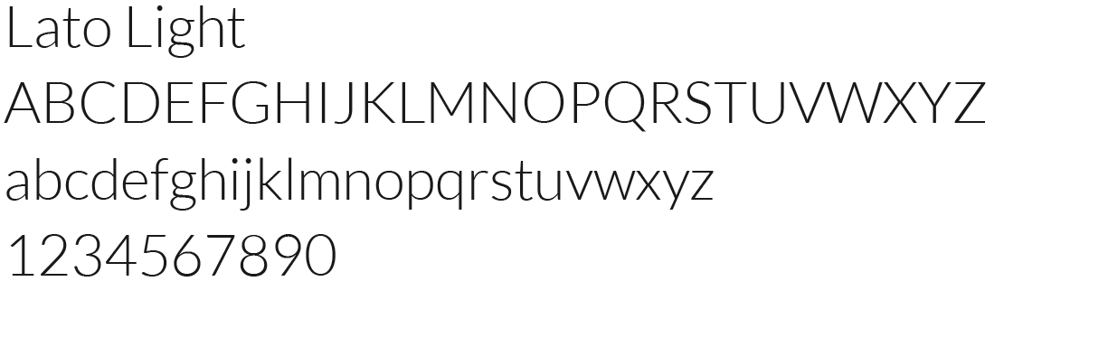
Lato Light
Body Copy
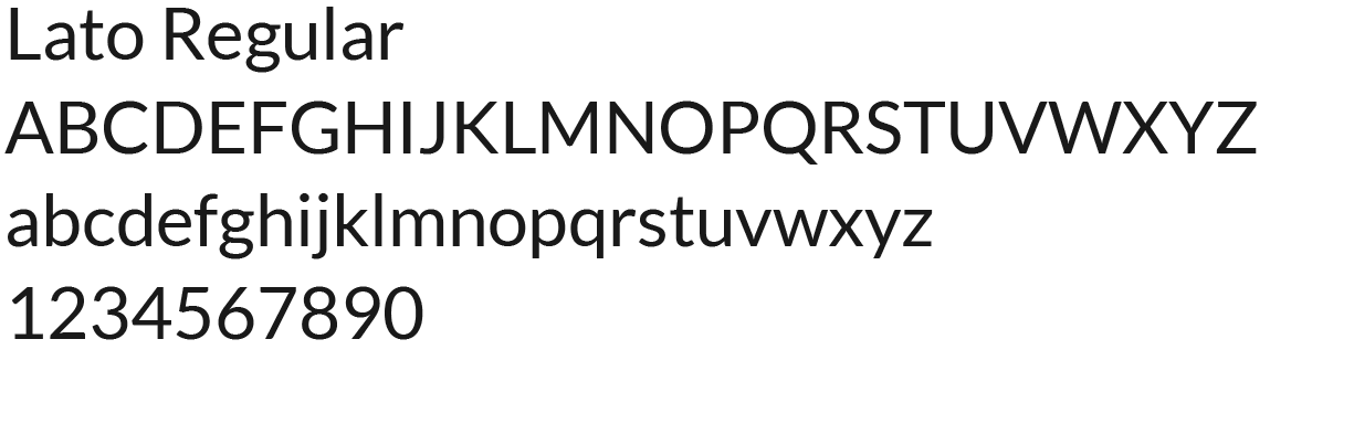
Lato Regular
Microsoft Office Headlines
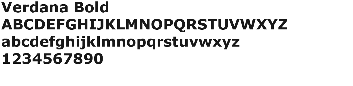
Verdana Bold
Microsoft Office Body Copy
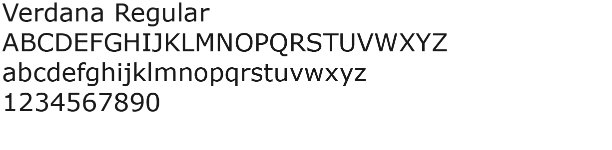
Verdana Regular
Language
Voice
Every word we use to represent Klausing Group—every RFP, social media post, and page on our website—impacts our brand. Consistent use of language helps us build trust and connect with the people we interact with.
Articulate
We are experts in horticulture. We empower others to make the best decision for their green spaces.
+ Write it like you’d say it. Avoid industry lingo when possible.
+ Do not use flowery language or hyperbole. Be specific.
+ When a smaller word works, use it.
Motivational
We are inspiring but not lofty. We have conviction in our mission but are not self-important.
+ Speak in positives.
+ Don’t hedge what you are saying with qualifiers.
+ Be informative, not preachy.
+ Keep the result attainable.
Candid
We are bold but not brash. We do what is right because we believe it’s right. We do not compare ourselves.
+ Be straightforward. Don’t bury the lede.
+ Use active voice.
Authentic
We are our customers’ partner. We’re in this together; reflect that in all writing.
+ Write in the first-person.
+ Make it personal. Keep the customer in the language.
Elevator Pitch
We are setting a higher standard for landscaping. We provide smart landscaping to positively impact your bottom line, the environment, and the people you work with.
Introduction Story
The idea for the Klausing Group was formed in 1992 by two teenage brothers on a mission to buy a car. They started with a lawnmower and some fliers promising that “we’ll cut class to cut your grass.” Eventually, they cut enough grass to buy the car. And they kept going. The company mission has since evolved, and Klausing Group has become an industry leader redefining what your landscaping should do for your business, your neighbors, and the environment.
Category: Smart Landscaping
We believe landscaping should go beyond curb appeal. It has the potential to make a difference to your bottomline, your community, and the environment. Smart landscaping considers all of these aspects to be stakeholders in order create a plan for your landscape that is better for everyone.
Headlines
Sales Material Headlines
+ Your landscape is an asset, not an expense.
+ Leverage your landscape.
+ You expect assets to perform. Your landscape is no different.
Values-Driven Headlines
Web Header
+ Go deeper than curb appeal.
About Page
+ We hold ourselves to a higher standard.
Employment Page
+ We are changing an industry.
+ Be part of something bigger. Earth-sized big.
+ Maintain spaces that inspire.
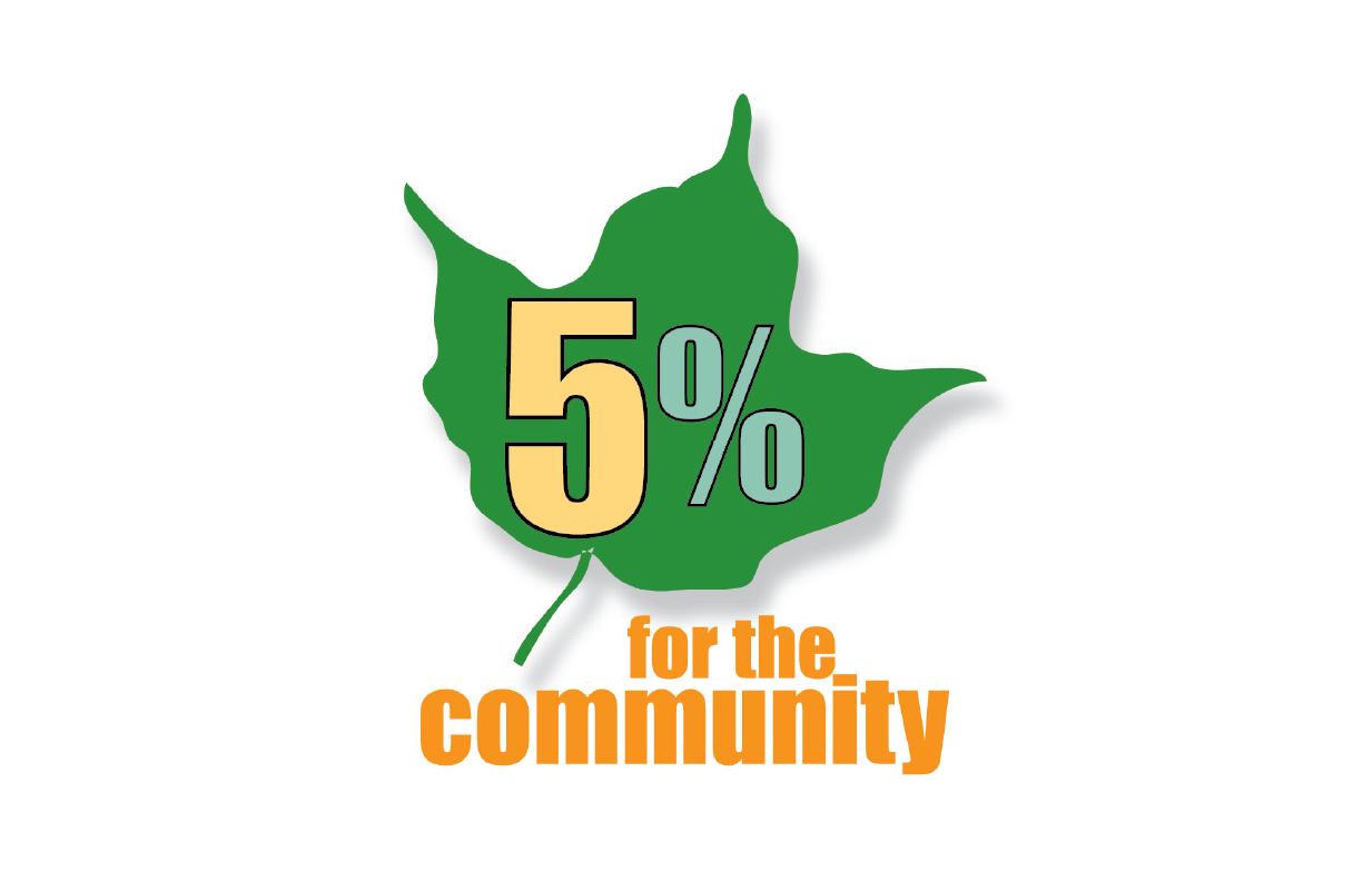
Illustration
5% for the Community
Swoosh
The Klausing swoosh symbolizes both a blade of grass and a horizon line. Apply the swoosh at full width where possible. The Klausing logo can be placed on the swoosh, in five configurations.

Trailer, Shirt, and Collateral
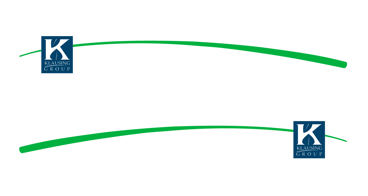
Truck and General Use
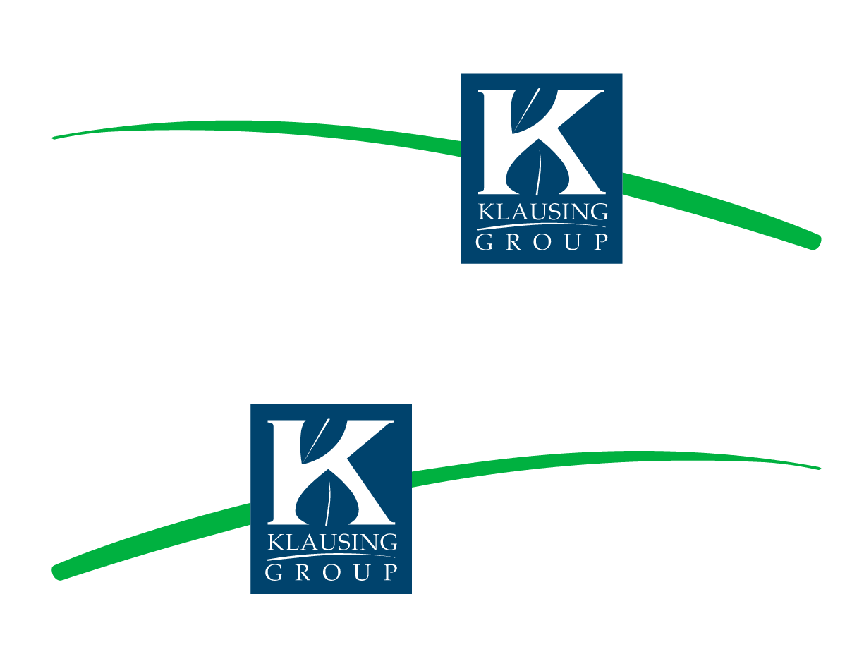
General Use
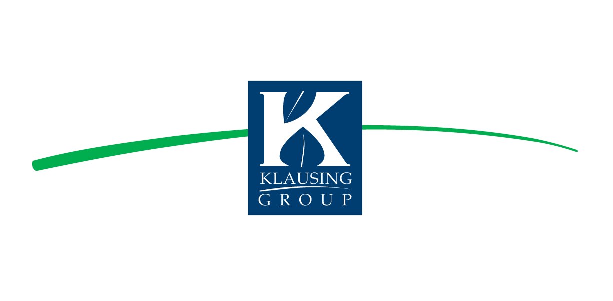
Collateral
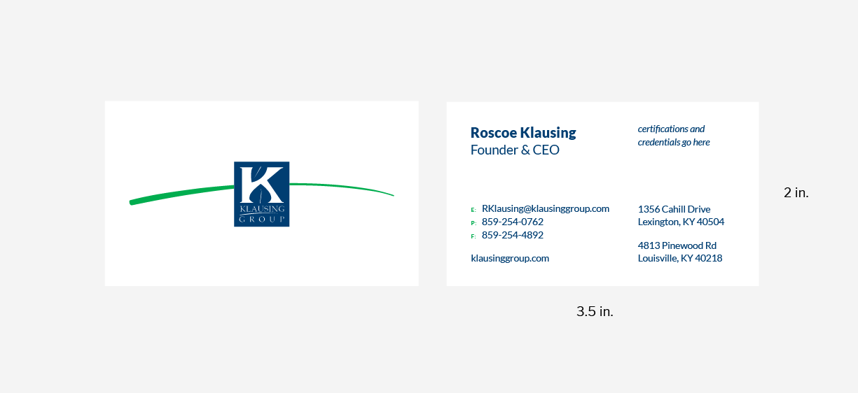
Business Card Template
Use this template when making standard 3.5” x 2” business cards.
Letterhead Template
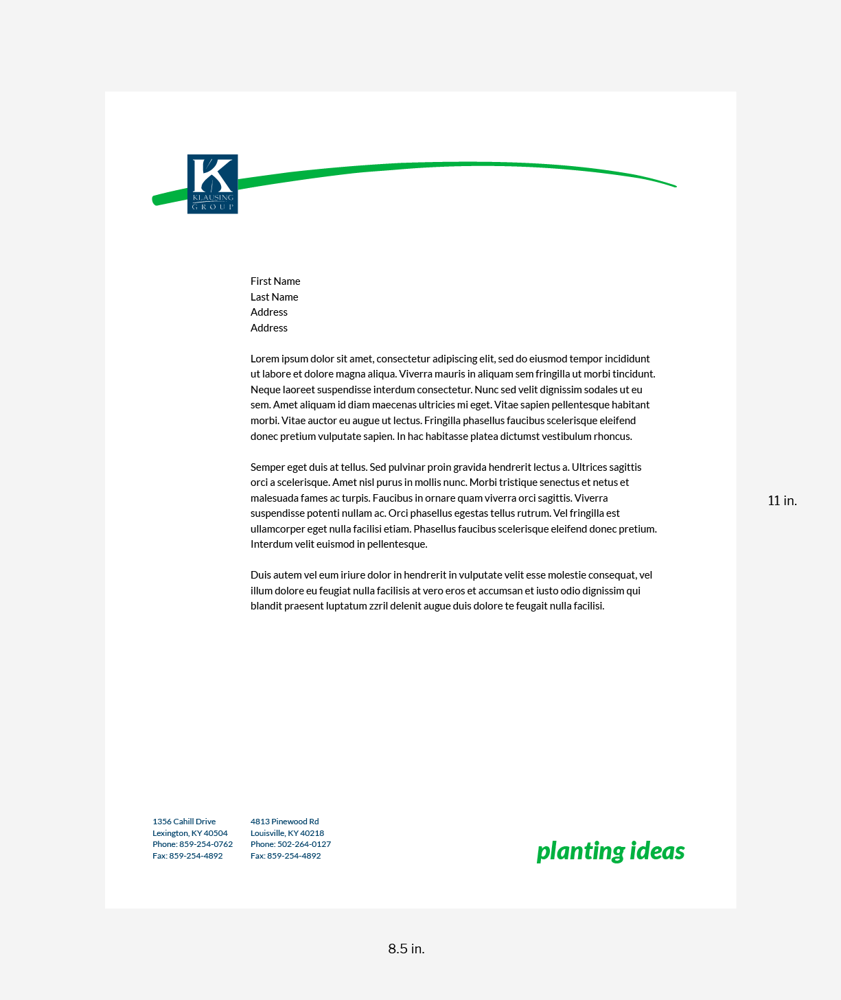
Use this template when making 8.5” x 11” letterhead.
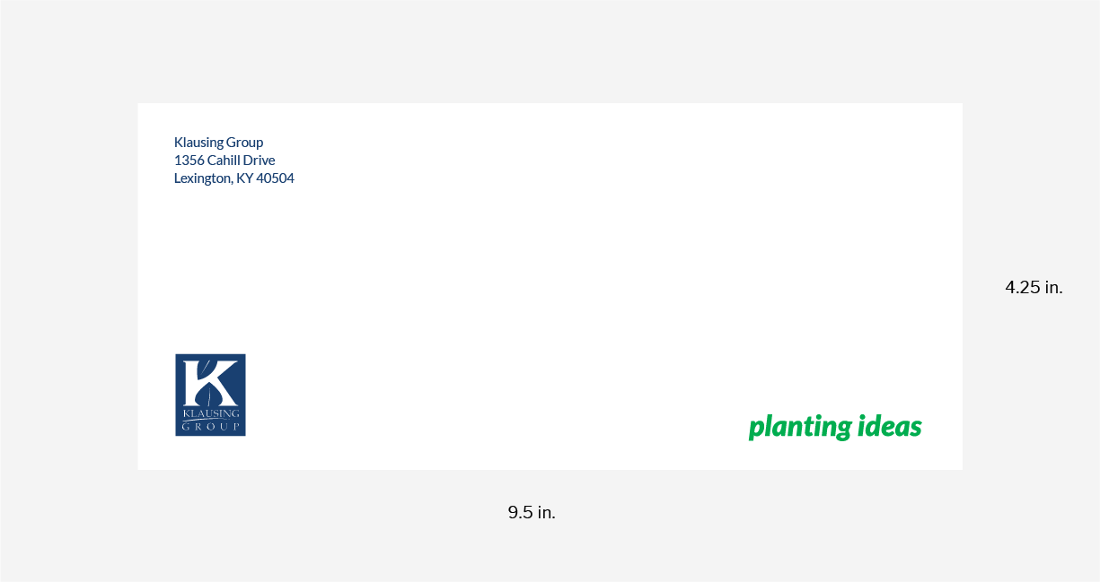
Envelope Template
Use this template when making #10 envelopes.
Social Media Assets
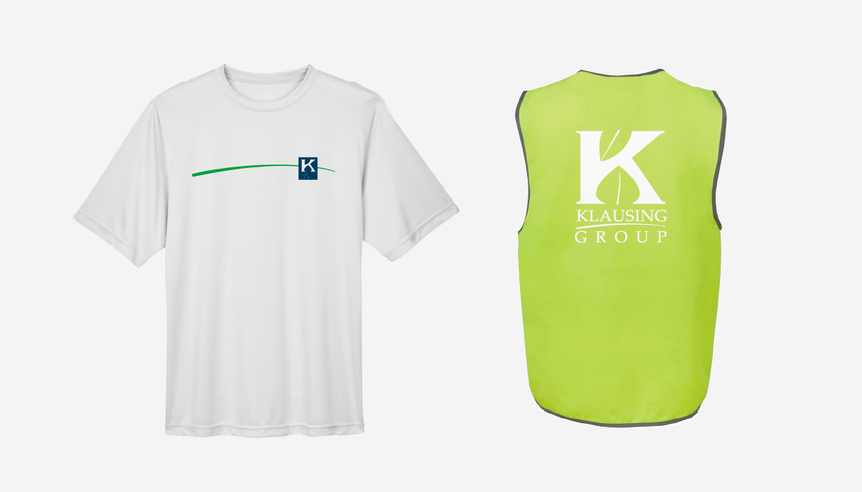
T-Shirts and Safety Vests
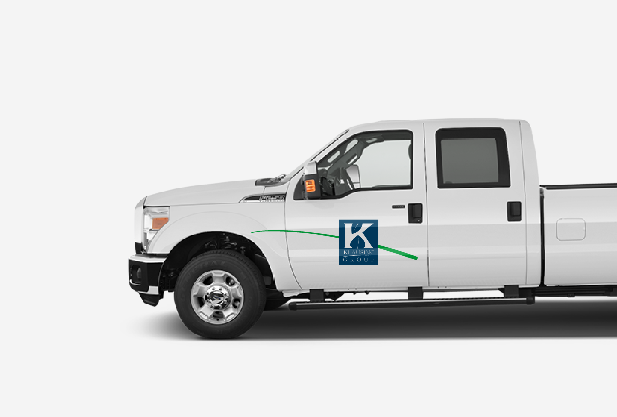
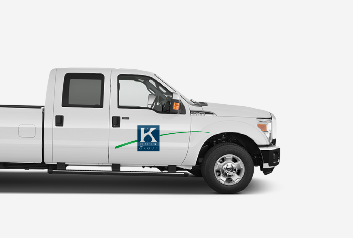
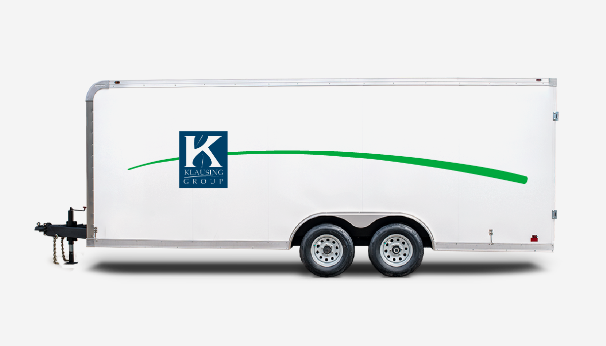
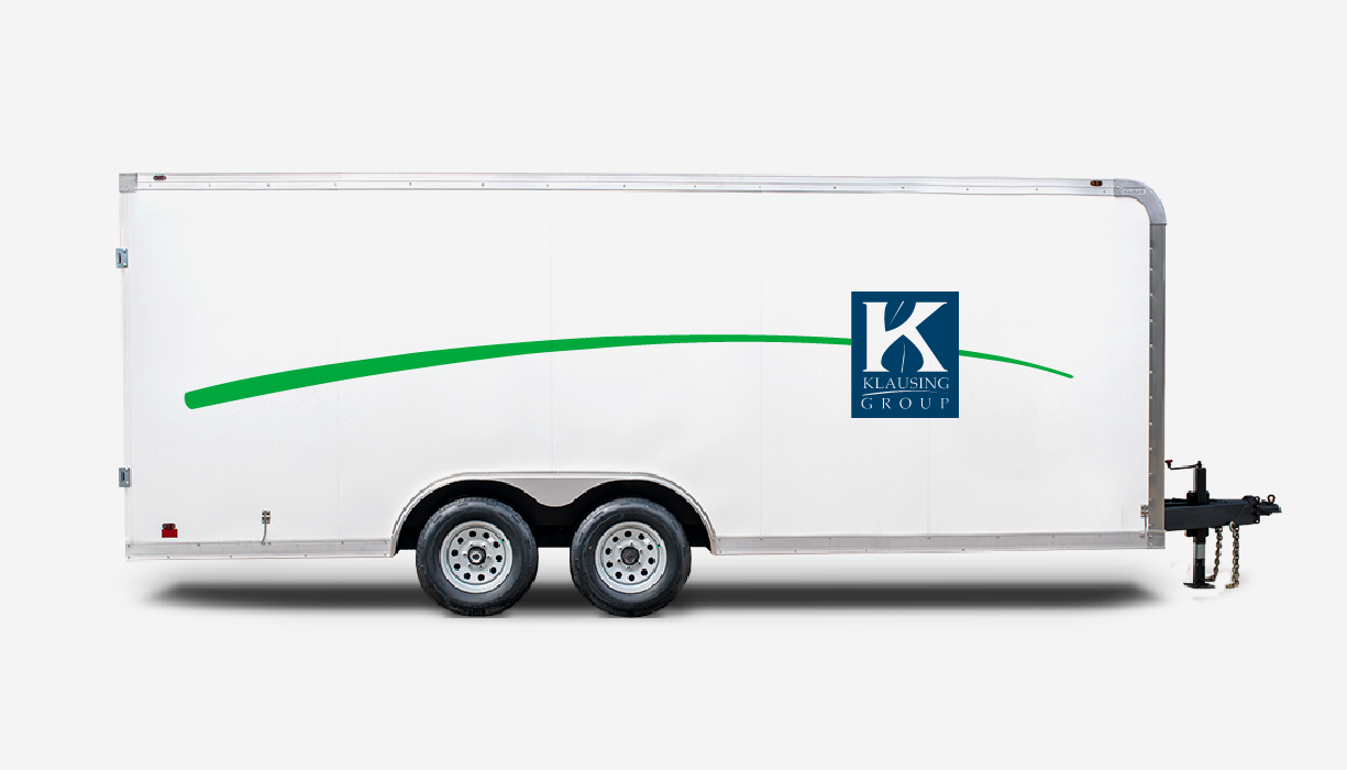
Vehicle Graphics
When applying the swoosh to vehicles, make sure the swoosh maintains proper front-to-back motion.
Trailer
Thank you.
Any questions or suggestions, please contact:
Roscoe Klausing
President & CEO
rklausing@klausinggroup.com
859.254.0762